Recorder’s Analytics: Recordings per device – Graph Over Time
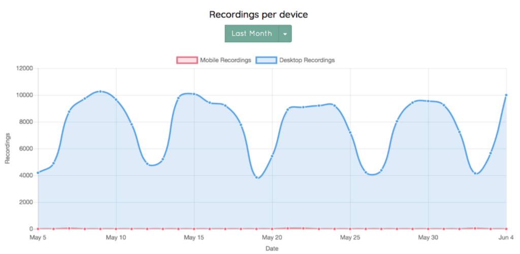 Not only does this graph distinguish the percentage of mobile and desktop users, but it also shows the number of recordings made on both devices over an indicated time period. This example diagram shows the number of desktop recordings far surpassed those made on mobile devices and how those recordings fluctuated based on whether it was during the week or the weekend. Changing the time frame from last month to last year, for example, can reveal trends in the number of recordings over time. This information can guide your team in future decision making as well as what to expect in the number of recordings that come in.